Bottom line
- Use a serifed typeface (such as Times New Roman)
for your body text.
- Use 12-point type for most body text.
- Prefer a sans serif font (like Arial) for your headings and illustrations.
- Use typesetting conventions.
Use a serifed typeface for your body text
The standard in the United States is a serifed typeface
for body text.
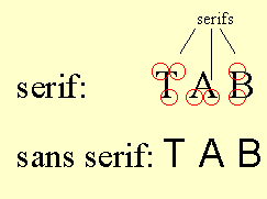
Serifs are the little lines some fonts have. Remember
this graphic when you read about headings?
The most popular serifed font for business writing today is Times New
Roman. I recommend it.
Note: You may notice that the typeface on this
Web site is sans serif (Verdana, in fact)—not Times New Roman. That's
because the resolution for your computer screen is not nearly as good
as the resolution for a printed page. Sans serif probably shows up a little
better on a computer screen.
Use 12-point type for most body text
The standard in business today is 12-point type. The
default in Word for Windows is 10-point type. That's too small for the
layout most people use.
If you're using Word for Windows, you should
change your default.
Prefer a sans serif font for your headings and illustrations
The most popular sans serif font is Arial. Here are
my suggestions:
- Headings. Normally choose the same size as your body text or
larger. For headings within bullets, though (like the heading for this
bullet), normally use italicized body text.
- Labels for illustrations. Use about two points smaller type
than you use for your body text. For example, if you use 12-point type
for your body text, use 10-point type to label your illustrations.
Use typesetting conventions
Word processing today will do most of this automatically,
such as giving you curly quotation marks and apostrophes rather than straight
ones. But here are some conventions you need to be aware of:
- Use italic instead of underlining. Underlining is a relic of
the typewriter days. Use underlining only for special circumstances.
- Use a real dash. Instead of using two hyphens (--), use the
typeset dash (). Sometimes Word will automatically change your two
hyphens to a dash (using AutoCorrect). If not, choose Insert …Symbol.
- Put one space after all punctuation. Typesetters have always
done this. You may have learned to put two spaces after periods, etc.
That was reasonable on typewriters (which had letters that were all
the same width). With the proportional type on your computer, however,
you're doing typesettingnot typewriting. Virtually every newspaper,
book, and magazine you're ever read has put one space after all punctuation.
(And so has this Web site.)
Your next step
Now let's turn to the look of your document's first
page.
Copyright
2007 by Edward P. Bailey
(all rights reserved)
|